
Twenty Thumbnails From Twenty Channels
Imagine opening your channel page on a friend's computer and seeing it for the first time with a stranger's eyes.
Twenty thumbnails in front of you.
One has a bold yellow typeface because you liked yellow that month. The one below it has thin white text. The third has your name in the corner, the fourth doesn't show your name at all. The fifth you designed in a hurry ten minutes before publishing.
All of them are yours. And all of them look like they come from different channels.
If your name were removed from above them, nobody would know they belonged to one person.
What a Visual Identity Actually Is
Plenty of people think it means a logo and a banner. It really means the things that repeat in every video until they become a mark.
And the practical test is the one we just ran: if your channel name were removed from the thumbnail, would your subscriber know it's yours?
Its real benefit isn't beauty, it's speed. The viewer recognises you in half a second among twenty thumbnails, and leans towards clicking because they know you.
Three Decisions Only
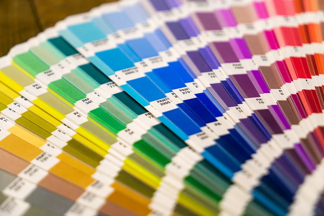
Two Colours
A primary colour that appears everywhere, and a contrast colour for emphasis and separation.
How do you pick them?
Don't pick what's fashionable, pick what differs from competitors in your field. If everyone uses blue, orange makes you visible.
Make sure of the contrast, because two colours of similar tone dissolve into each other when scaled down.
And test them in black and white. If the difference disappears without colour, the contrast is weak.
You can add an optional third: a neutral for backgrounds, a grey or an off-white.
One Typeface
One Arabic typeface in two weights: bold for titles, regular for body.
Its conditions for Arabic: legible when heavily scaled down, thick enough to read on a thumbnail, and consistent in how it renders numerals.
And don't mix many typefaces. One typeface in two weights looks more professional than three different ones.
A Fixed Layout
Where does text sit? Where does your name appear? What do title cards look like?
A fixed position for on-screen text. A fixed position for your name in the thumbnail. A fixed shape for name cards and titles.
And this decision matters more than colour and typeface combined, because it's what makes your thumbnails look like one family even when their content differs.
And What You Don't Need Yet
A professionally designed logo. Your name in your chosen typeface is enough to start.
An animated intro badge. Everyone skips it, and it hurts retention in the first seconds.
Signature music. It comes later and isn't essential.
And a twenty-page brand guide. Three decisions in one file is enough.
How to Lock It In Practically
Build one template in whatever design tool you use, and work on that every time instead of starting from scratch.
And write your decisions in a simple text file:
Primary colour: #a1794b
Contrast colour: #1d1d1f
Typeface: [name] — bold for titles
Name position: bottom right of thumbnail
An identity gets lost through forgetting, not through decisions. Three months from now you won't remember the exact shade you used, you'll approximate it, and that's how twenty thumbnails start drifting apart from each other.
And When to Change It
Commit to at least six months before any change.
Identity works through repetition, and changing it every month means it never worked at all. A viewer needs to see it several times before linking it to you.
And when you do change, change everything at once. Not one thumbnail in the new style and another in the old. Gradual transition looks like chaos rather than evolution.
In Short
Two colours, one typeface, a fixed layout. Three decisions that take half an hour.
Then stick to them for six months.
Because a visual identity isn't what you design once. It's what you repeat until it's recognised.