
Two Hours on a Big Screen, Half a Second on a Phone
You spent two hours on the thumbnail.
You picked the frame carefully, cut out the background, tuned the colours until you liked them, wrote a nice line in an elegant thin typeface, and added a soft shadow under the text to make it look cleaner.
You stood back and looked at it on your big screen, and it was excellent.
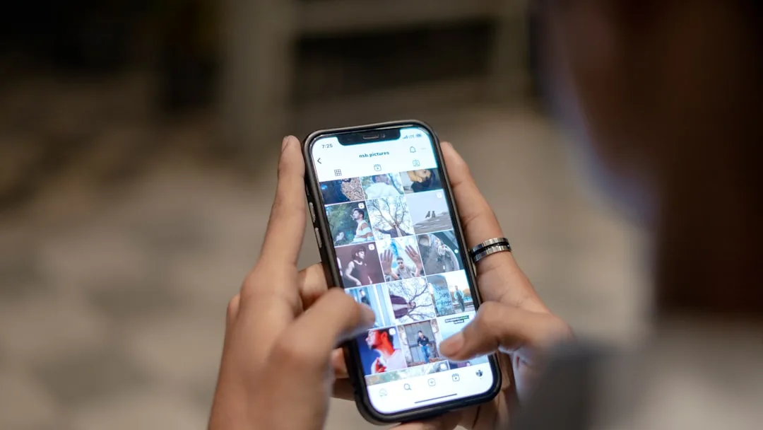
Then you published the video and pulled out your phone to see it the way people see it.
And there it was in a small rectangle the size of two fingers, wedged between nineteen other thumbnails. The elegant thin text had turned into an illegible grey smear, the background you'd carefully cut out had become a blob, and your face in the shot had become a dot.
You couldn't tell what was in your own thumbnail. So how would someone passing it in half a second?
The Condition That Governs Everything
A thumbnail isn't viewed on the big screen you designed it on. It's viewed in a small rectangle on a phone, among twenty others, in under a second.
Which means every design decision is settled by one question: is this understood at a glance?
And a practical test before uploading: shrink the image to thumb size and look at it. If you can't understand it, nobody will.
The Three Elements and Their Limits
One visual element. A face, an object, or a scene. Not three at once. A crowded image reads as chaos and gets skipped.
Two or three words. Not a sentence. Text on the image isn't a second title, it's an addition to it.
A simple background. If the background is busy, blur it or darken it. The contrast between subject and background is what makes the subject appear.
The Relationship With the Title
This is what beginners get wrong most: they write the title itself onto the image.
The result is that you've wasted half your space. The title is already visible under the thumbnail, and repeating it adds nothing.
| The title says | The thumbnail shows |
|---|---|
| "How I shot this on my phone" | The shot itself, with the text: "on a phone?" |
| "Seven lighting mistakes" | A face half of it badly lit |
| "I visited the most dangerous market in the city" | A moment of real tension from the video |
The rule: the title promises, and the thumbnail proves it or provokes curiosity. Together they create a question that can only be answered by clicking.
Faces: When They Help
A face attracts the eye naturally, but not any face.
What works: a genuine expression connected to the video's content, and a close shot whose features are visible in a small rectangle.
What doesn't: an exaggerated expression with nothing to do with the video. That earns a first click and costs you trust, and a viewer who felt tricked doesn't come back.
And if you don't show your face, the alternative isn't a lesser one: the end result, a before-and-after comparison, or the object of the video in close-up.
Arabic Text on the Image
Arabic has a particular consideration people miss.
Thin typefaces disappear when scaled down, which is what happened in our story. Use a bold, clear typeface.
Diacritics can't be read at that size, so drop them entirely.
And connected letters need spacing, so don't compress the text.
And test it in black and white. If the text disappears when colour is removed, the contrast is weak even if it looked fine in colour.
Common Mistakes
A frame lifted straight out of the video. A random frame isn't a design.
Arrows and circles everywhere. They used to work. Now they read as cheap advertising.
Text in the bottom right corner, where the video's duration badge covers it.
An image that only suits one platform. Aspect ratios differ, and cropping cuts off the text.
And promising what isn't in the video. The fastest route to losing trust.
Consistency Versus Standing Out
There's a genuine tension between two things: similar thumbnails make your channel instantly recognisable, while different ones catch attention among others.
The middle path: fix the typeface, the colour, and the text position, and vary the image and the expression. The form stays recognisable while the content stays fresh.
And Test After Publishing
The thumbnail is the cheapest thing to change after publishing.
If a video gets plenty of impressions and few clicks, change the thumbnail rather than deleting the video. And wait a week before judging.
And change one thing at a time, the thumbnail or the title but not both, otherwise you won't know which one helped.
In Short
Clarity before beauty. One element, not three. Two words, not a sentence. Completing the title, not repeating it.
And any thumbnail that can't be understood at thumb size wasn't ready to publish, however good it looked on your screen.