
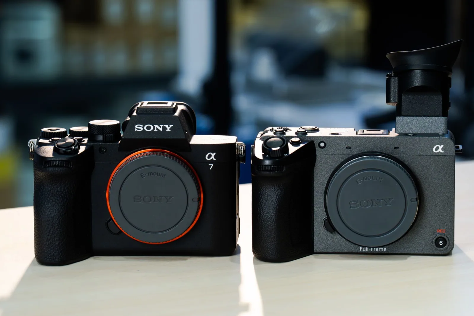
He filmed a comparison between two cameras, used both for two months, and gave his honest verdict at the end: the first one was better for him.
Two days later the comments read: "paid by the first company", "clearly biased against the second", "why didn't you mention that it does X?"
He had taken nothing from anybody. He had been entirely honest.
The problem is that being honest is one thing, and making honesty visible is another. The second is built in the script, not in the heart.
Why people doubt you even when you are honest
Because a viewer cannot see your intentions, so they judge what they can see: the order of the argument.
Most comparisons are written in this order: show the first one and praise it, show the second one and list its flaws, then say "the first is better". So the viewer hears a verdict preceded by selected evidence, even if the evidence is true.
The fix is simple: declare your criteria before your verdict. Once the viewer knows what you are judging by, they can disagree with your weighting and still agree with your conclusion, which is the most you can ask of a viewer.
A structure that works in any comparison
1. Who this video is for (20 seconds). "This is a comparison for people who film alone and carry their bag every day. If you work in a fixed studio, your decision is different." That sentence earns the trust of the half who resemble you, and sends the rest away without a quarrel.
2. The criteria and their weights. Three to five criteria, declared before any verdict, with their weight for you: "audio matters more to me than resolution, and size matters more than button count." The weighting is what lets a viewer do the maths for themselves.
3. Compare criterion by criterion. The most important structural decision, and we will come to it.
4. Where each one wins. An explicit section: "the second one wins here and here, no argument." This section is the strongest proof of your fairness.
5. A conditional recommendation. No absolute winner, but: "if you are X, take this one; if you are Y, take that one."
Criterion by criterion, not product by product
The difference between the two structures decides the shape of the whole video:
The wrong structure (product by product): ten minutes on the first, then ten minutes on the second. The viewer forgets what you said about the first before you finish the second, so they cannot compare, and it feels as if one of them got the better share.
The right structure (criterion by criterion): audio on both, then picture on both, then size on both. The comparison happens inside the viewer's head moment by moment, and the time is visibly divided evenly.
That structure shares one risk with the list video: repeated rhythm. So change the shape of each criterion: this one as a practical test, that one as two shots side by side, the next as another user's opinion. The cures for list monotony are in the list video: why it works and how to keep it from getting dull.
Six practices that make fairness visible
Test in identical conditions. Same room, same light, same distance, same time of day. And show the viewer that you did.
Start with the flaw of the one you prefer. If you lean towards the first, name its weakness first and plainly. One sentence buys you ten minutes of trust.
Name the best thing about the one you do not prefer. In detail, not as a courtesy line.
Declare where the gear came from. "I bought it with my own money", or "it arrived as a gift and they asked for nothing", or "this video is sponsored". And disclose it at the start, not the end. As for writing the sponsored video itself, its rules are in writing a sponsored segment without losing your audience's trust.
Compare what can legitimately be compared. Two generations apart, or two price brackets apart, is not a comparison; it is a known result.
Say how long you used each. "I used the first for six months and the second for two weeks" lowers the viewer's expectations to the right level and protects you from a comment saying you never really knew it.
Two is better than five
A comparison between two things is cleaner than one between five. Five options means a minute each, and the viewer leaves with no decision.
So if you have five, make the video two stages: rule three out quickly with one clear reason each, then spend the video on the remaining two. A viewer wants a decision, not a parade.
When a comparison works and when it hurts
| The situation | The call |
|---|---|
| Both are in one category and people genuinely hesitate between them | an excellent comparison |
| One is clearly better | a review of one is more useful than a comparison |
| You never really used one of them | do not film it |
| The whole difference is price | make the video about price rather than the products |
| You are sponsored by one side | write it as a review with the sponsorship declared, not as a comparison |
The ending: a condition, not an absolute winner
The weakest ending: "the first one is better." The strongest: "if you film alone and move a lot, take the first; if you work in one place and want the best picture, take the second. I personally chose the first, and here is why."
That ending does three things: it gives the viewer a decision, it preserves your fairness, and it states your opinion plainly. A plain opinion is wanted; total neutrality is dull and nobody believes it.
That same rule underpins the review video, where the section that matters most is the one naming who the thing suits and who it does not.
Five lines before you film
Write this on one page:
Who this video is for, and who I rule out. Then the criteria with their weights. Then what the one I do not prefer wins. Then the flaw of the one I prefer. Then the conditional recommendation in two sentences.
Five lines, and a video whose maker gets accused of bias becomes a video that gets shared because it helped somebody decide.