
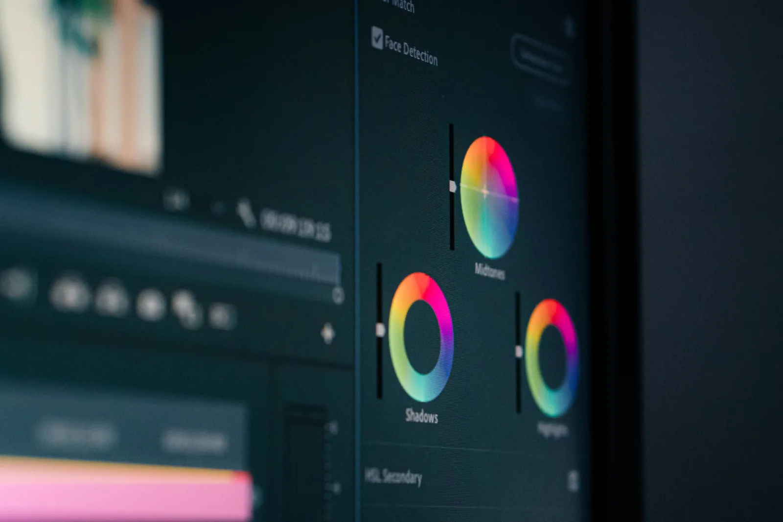
He downloaded a "cinematic look" file from the internet and dragged it onto every clip in one go. He looked at the screen and liked it: the picture had character, the shadows went green, the sky went purple.
He published the video. A week later he opened it on his brother's phone and found orange faces, as if everyone had a fever, a white shirt turned cream, and the shadows one black mass with nothing in them.
The look was not bad. It was applied first instead of last, so everything was built on a tilted foundation.
Two different words people mix up
Colour correction means making the shot right: sensible exposure, white that is white, natural skin, and shots in the same scene that resemble one another. This is compulsory work on every video.
Colour grading means giving the video a character: cooler, warmer, less saturated, with a personality. This is optional and lovely, but it goes on top of correction, not instead of it.
Starting with the look is like painting a wet wall: it looks fine in the moment, then it peels.
Five steps you never reverse
1. Exposure. Set the brightness of the shot first. Take it up or down until the face reads, then watch the whites so they do not blow and the blacks so they do not crush. Everything after this step depends on it.
2. White balance. Remove the cast: if the shot is blue, warm it; if it is orange, cool it; then deal with green using the tint control. The reference is always skin. And if the reasons shots change colour are not clear to you, they are in white balance and colour temperature.
3. Contrast. Only now make the picture deeper. The rule: contrast eats information, so add a little and watch your darkest and brightest areas.
4. Saturation. Raise it slightly if the picture is flat, drop it slightly if the shot is noisy with colour. This is the most abused control there is.
5. The look. Now, at the end, apply the look if you want one, at a fraction rather than in full: fifty per cent or less. A look you can plainly see is a failed look.
Matching is most of the work
What separates a video that feels professional from one that feels assembled is not how beautiful a single shot is, but that all the shots come from one world.
The method is practical:
Pick a reference shot. Your best shot in the scene. Correct it first and make everything else match it.
Match faces, not walls. A wall may legitimately differ in colour, but the skin of the same person has to be the same in every shot. Keep your eye on the skin.
Put the two shots side by side. Most software lets you compare two frames. A side-by-side reveals differences you will not see by jumping between them.
Go from the wide to the close. Correct the wide shot, then match the closer ones to it, because the eye trusts the wide more.
And remember that some "colour problems" are solved by deleting the shot rather than correcting it, which is the first principle of editing we covered in editing basics: start by deleting, not adding.
Do not trust your eye, read the scopes
Your eye adapts to any cast within minutes. Sit half an hour in front of a blue image and it becomes normal to you, so you add more blue.
That is why software has scopes that read the picture as numbers:
- The waveform: shows brightness. Keep the blacks near zero without sticking, and the whites under the ceiling without hitting it.
- The vectorscope: shows colour and its direction. It has a diagonal line called the skin tone line, and human skin (any person, any skin colour) sits on or around that line. If your subject's skin sits far from it, you have a cast rather than a look.
One minute with those two scopes saves you an hour of guessing.
Four mistakes that show on other people's screens, not yours
Too much saturation. It looks lively on your computer, and on a phone it goes garish and the skin slides orange.
Crushed blacks. You drive the shadows until they are pure black and everything inside them is gone. On a cheap screen it becomes an empty patch.
Blown whites. A white shirt or a sky with no detail. And this cannot be fixed if it was blown while filming.
Unmatched shots. A warm shot after a cold one leaves the viewer feeling something is untidy, even if they cannot name it.
Before exporting, watch the video once on your phone and once on another screen. That is the cheapest check and the most useful.
How to use a ready-made look
LUTs are not forbidden, but they are not a magic button either.
Use them after the first four steps, not before. Drop their strength to half. Apply them to the whole scene rather than one shot. And do not put a LUT made for Log footage onto a clip shot with a normal profile, because the result will be an ugly exaggeration.
Better still: once you have one shot looking the way you want, save your own settings as a preset and use it on the next videos. That is how a colour identity is built for your channel instead of borrowing someone else's.
And should you shoot Log?
Log keeps more detail in shadows and highlights, so it gives you more room in correction. The price is that every shot needs work, and that noise shows more in low light.
The rule: if you publish weekly and correct quickly, a normal profile set properly in camera is kinder to your time. If you are making a film you will work on for weeks, Log earns the trouble.
Where to stop
Three minutes per shot is enough on most videos, and half an hour for the whole thing.
The sign to stop: open the video tomorrow with rested eyes, and if you do not notice the colour at all while watching, the correction worked. If colour is the first thing you notice, you reached the limit and went past it.
And if your scene has cutaways from mixed sources (archive, a phone, a second camera), those need matching most, and their role in the edit is covered in cutaways: when to use them and why.